01SIGNAL
EIH
Wide grotesk / interrupted crossbar
001 Typographic Logo Showcase
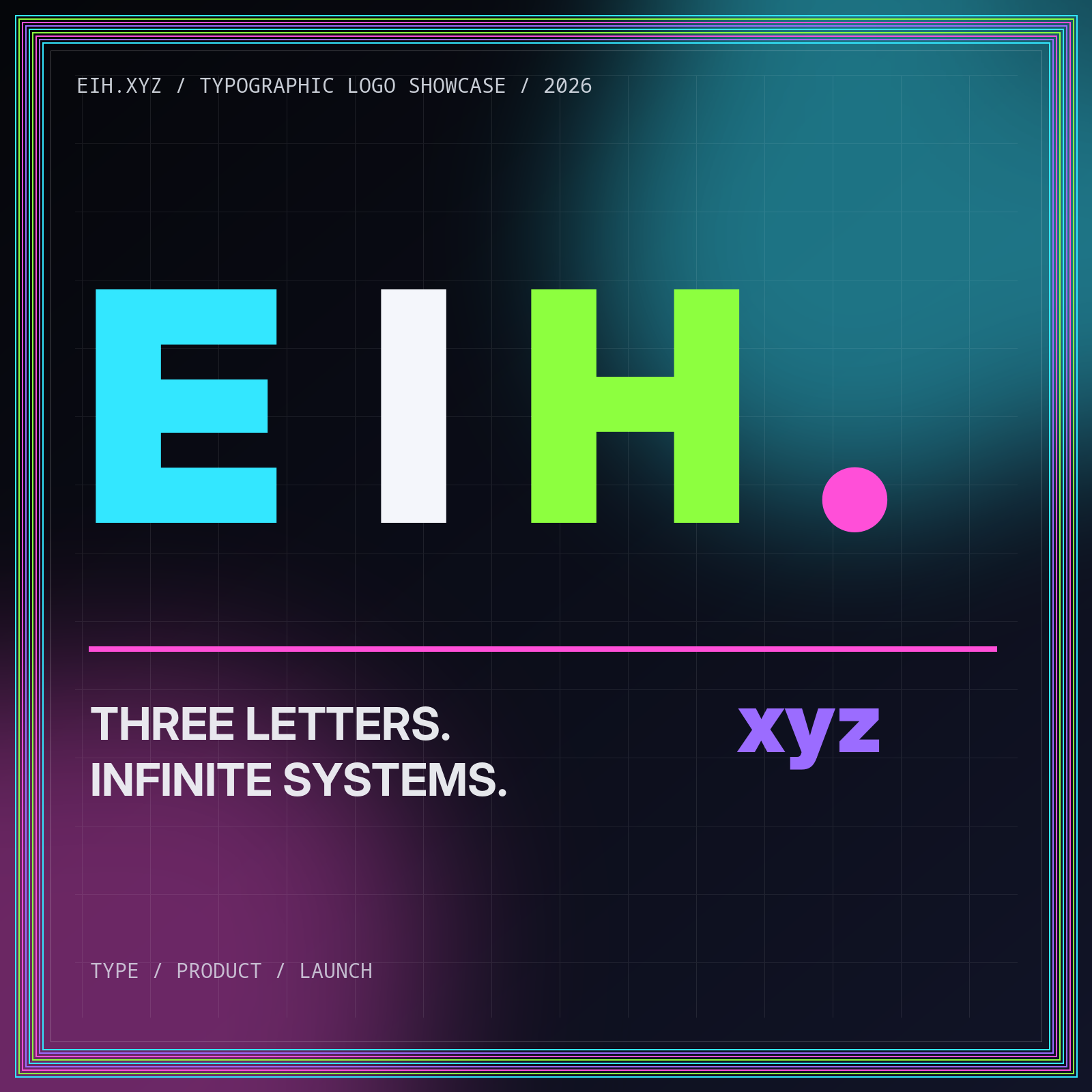
EIH.xyz explores bold typography, minimal UI, responsive wordmarks, and launch-ready identity systems for tech startups, cloud platforms, API-first products, and future-facing digital brands.
002 Identity directions
Each concept tests a different relationship between the E, I, H, the dot, and the .xyz domain. The collection moves from utility wordmarks to compact interface marks without treating decoration as strategy.
Wide grotesk / interrupted crossbar
Modular stencil / shared verticals
Soft mono / orbital dot
Condensed display / chromatic offset
Developer syntax / bracket lockup
Domain wordmark / terminal cursor
003 Brand systems
EIH.xyz treats the mark as the entry point to a wider digital system: typography, color roles, grids, responsive behavior, interface language, and asset governance.
Explore the systemDecide how the initials, domain extension, product names, and descriptors work together before drawing a family of marks.
Build a scale that can handle launch headlines, interface labels, long-form editorial, documentation, and technical data.
Switch intentionally between full wordmark, compact lockup, and small-size mark across product and marketing surfaces.
Ship semantic HTML, compiled Tailwind CSS, lightweight JavaScript, structured data, sitemap, and RSS with no runtime backend.
004 SaaS launch design
A venture-ready launch page needs more than a dramatic hero. It needs clear positioning, real destinations, accessible navigation, credible technical detail, useful articles, and a coherent content model.
005 Signal Notes
A handoff workflow that turns approved identity concepts into a fast, accessible, static launch page without losing design intent.
A practical test matrix for checking recognition, accessibility, cropping, contrast, and consistency before a logo system ships.
A framework for turning a concise domain into a memorable naming system, visual identity, and product narrative.
006 FAQ
The showcase combines visual experimentation with practical identity and static-site guidance.
EIH.xyz is an independent typographic identity showcase and editorial field guide. It explores wordmarks, responsive logo systems, modern web design, and launch-page patterns for technology brands.
The showcase presents concept directions and design principles. It does not claim that the displayed marks are cleared for trademark use or offered as exclusive commercial identities.
Wordmarks and lettermarks connect recognition directly to the name. They are especially effective for concise digital brands that need to work in product navigation, documentation, social cards, and small interface surfaces.
No. EIH.xyz is delivered as a complete static website with compiled CSS, lightweight JavaScript, clean directory URLs, an XML sitemap, and an RSS feed.
007 Contact
Send a concise note about the name, product context, or design system you are exploring.
Email [email protected]